Thursday, March 8, 2012
Wednesday, March 7, 2012
Blog #8
The theme of Becoming Jane is love and loss. Jane clearly loves Tom and Tom clearly loves Jane. They realize that their love cannot grow for they have no money and no status. They will never be able to start a family that will live happily and thrive. If they would give in to their emotions it would ruin their families acceptance of them. It is better to live apart then on the streets with many hungry and unhappy children. They will always love each other, but they must move on.
Line is visible in the scene since they are both situated in a window. The line on the left of Jane is mirrored by her body and this creates a parallel in which the scene becomes more balanced. The same with Toms character. When they both stand up and we are faced with a wide shot of the two of them, the lines of the window are again parallel with the two bodies and this creates balance. Jane’s face shape is very oval. Tom’s face shape is very oval and these two shapes help us recognize that they will be together. Both characters have triangular shapes on their necks due to their costumes. The space behind Jane seems more limited than Toms. Toms space is very deep and continues to become ambiguous further back. The rhythm and pacing of the scene is well choreographed. The scene is a back and forth between Jane and Tom but does not feel to forced like a ping pong match. Once the couple starts to quarrel and Tom realizes Jane is leaves the Rhythm picks up in speed. The scene continues to jump back and forth between Jane and Tom, but not it is a little bit more forced to stress intensity and drama. Overall the scene is well edited and directed. You are able to perfectly understand what is happening. The background on each character is dull and uneventful so your eyes focuses on the main character. Plus the light coming in the window helps direct your eye to the couple.
Blog #7
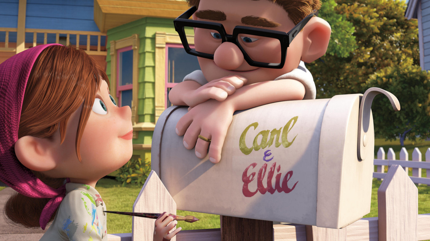
Each of these pictures from the movie “Up” has a different emotion and look. The first picture is a picture that is from Carl’s past. It is of him and Ellie when they were children. The hue has many browns that are represented in the dark wood paneling behind Ellie. The greens and yellows of the children’s clothing add to the dark musty coloring represented in the picture. The brightness is low and dim. The darkness of the coloring also adds to the reason why the brightness is so low. There are hardly no bright colors in the picture. The saturation is medium. Its not totally unsaturated but the colors are not saturated enough that the vibrate off the frame. Many shadows are used to give the room depth. Ellie has shadows on her face from her crazy hair above her. The mood of the scene is adventure and curiosity. The next picture of Ellie and Carl is very bright, airy and vibrant. The hue has has a lot of greens and whites. The picture is very bright and light because the sun is shining down above them. The light is also high because the scene takes place outdoors. The saturation is very high. The colors pop out and are vibrant. Many pinks, greens, whites and blues are saturated to give a happy mood. The picture has little shadows. There is a small shadow on the mailbox because of the placement of the sun. There is also a shadow on the house behind Ellie and Carl because of the placement of the sun. Shadows have been created on Carl’s face from his large glasses. These placements of shadows give depth and make the scene more realistic looking. This scene is opposite look of the one before it because of the amount of light and the amount of saturation. Even though it involves the same characters years later, the difference in the lighting and mood is very large. Also the first picture was set on the inside of a building and this second one is set in the front yard of there new house. The mood given in the scene is a mood of stress free, happy, light, care free and natural.
Tuesday, March 6, 2012
StoryBoard Blog # 6


Yes the director followed the 180 degree rule when filming this scene in Pride and Prejudice. The camera never passes the 180 degree wall during this short scene. The 180° rule is a basic guideline in film making that states that two characters (or other elements) in the same scene should always have the same left/right relationship to each other. If the camera passes over the imaginary axis connecting the two subjects, it is called crossing the line. The director also follows the Rule of Thirds guidlines. Both subjects are never placed in the center of the square. They are always put in the axis’s where the squares meet and never are centered. So it is following the rules. This scene is also following the 30 degree rule. The 30° rule is a basic film editing guideline that states the camera should move at least 30° between shots of the same subject occurring in succession. This change of perspective makes the shots different enough to avoid a jump cut. Too much movement around the subject may violate the 180 degree rule. Following this rule may soften the effect of changing shot distance, such as changing from a medium shot to a close-up.
Joe Wright the director of Pride and Prejudice seemed to follow all of these rules throughout the whole movie.
Blog #5
Gotye - Somebody that I use to know
Gotye - Somebody That I Use To Know (Original)
Listening Phase 1
Tempo- Medium
Source- guitar
Groove- the groove is funky and quirky.
Listening Phase 2
Instrumentation-
guitar, drums, and electronics drive the song.
Structure/Organization-
There is a verse, chorus, verse, chorus and reprise.
Emotional Architecture -
The song builds using an increase in volume and more instrumentation. Plus adding a female voice to the second verse helps. The song drops with the end of the second verse and the beginning of the second chorus. The high female note allows for the song to drop before the second chorus arrives.
Listening Phase 3
Balance
Height-
The frequency is low and switches to high in the second verse and chorus.
Width-
The stereo does not pan left or right during the song.
Depth- There is little depth until the chorus happens. The chorus has the most depth in the song.
______________________________________________________________________
Gavin Mikhail - Somebody That I Use To Know (Cover)
Listening Phase 1
Tempo - faster. between medium and fast.
Source- Piano
Groove- somber and classical
Listening Phase 2
Instrumentation -
Piano
Structure/Organization
There is a verse, chorus, verse, chorus, reprise.
Emotional Architecture
The song starts with little volume and is sad and emotional. The chorus kicks in with punching vocals and piano but the quiets back down during the second verse. The second chorus and reprise are louder and more powerful.
Listening Phase 3
Balance
Height-
This version of the song carries a higher frequency.
Width -
The stereo does not pan from left to right.
Depth-
There were several layers of the piano in the song which gave it depth.
______________________________________________________________________________________________
Essay
These two songs carry different emotions for me as a listener. Each one has its own emotion. The original song has a kind of smart ass, screw you vide. The song makes you want to move on from the pain that your significant other caused you, and not linger over them. It's a good song to play after a fight that you just won. The second song gives a vibe of sadness and loss. The song makes you feel the sting of a bad relationship and a messy break up. Its a tad faster and darker then the original version. The lyrics and Melody stay the same, but the intensity and timbre are different. The timbre is higher in the second version of song then in the original version. The first song has much more instrumentation then the cover. It is using a guitar, bass, drums, and different quirky electronic sounds. The cover song only uses a piano. The artist creates depth by layering different piano parts on top of one another. The first song has depth, but because of the raw emotion of the second song, I feel as though the depth is more noticeable than the original. Height is also created in the original song by adding the female vocals in the second verse. This also adds to emotional architecture of the whole song. The first song is much more playful then the cover. It is a better song to dance to. The beat gets you tapping your foot and makes you want to hum along softly. The pop/alternative sound of Gotye’s song is a more mainstream sound.The cover song has more heartache and anger. The passion that Gavin puts into the song is clearly seen. This version of the song has a more alternative sound because of the piano and emotional vocals that Gavin gives.
Subscribe to:
Comments (Atom)